‘Along the Waterfront’ opens Friday

May 2

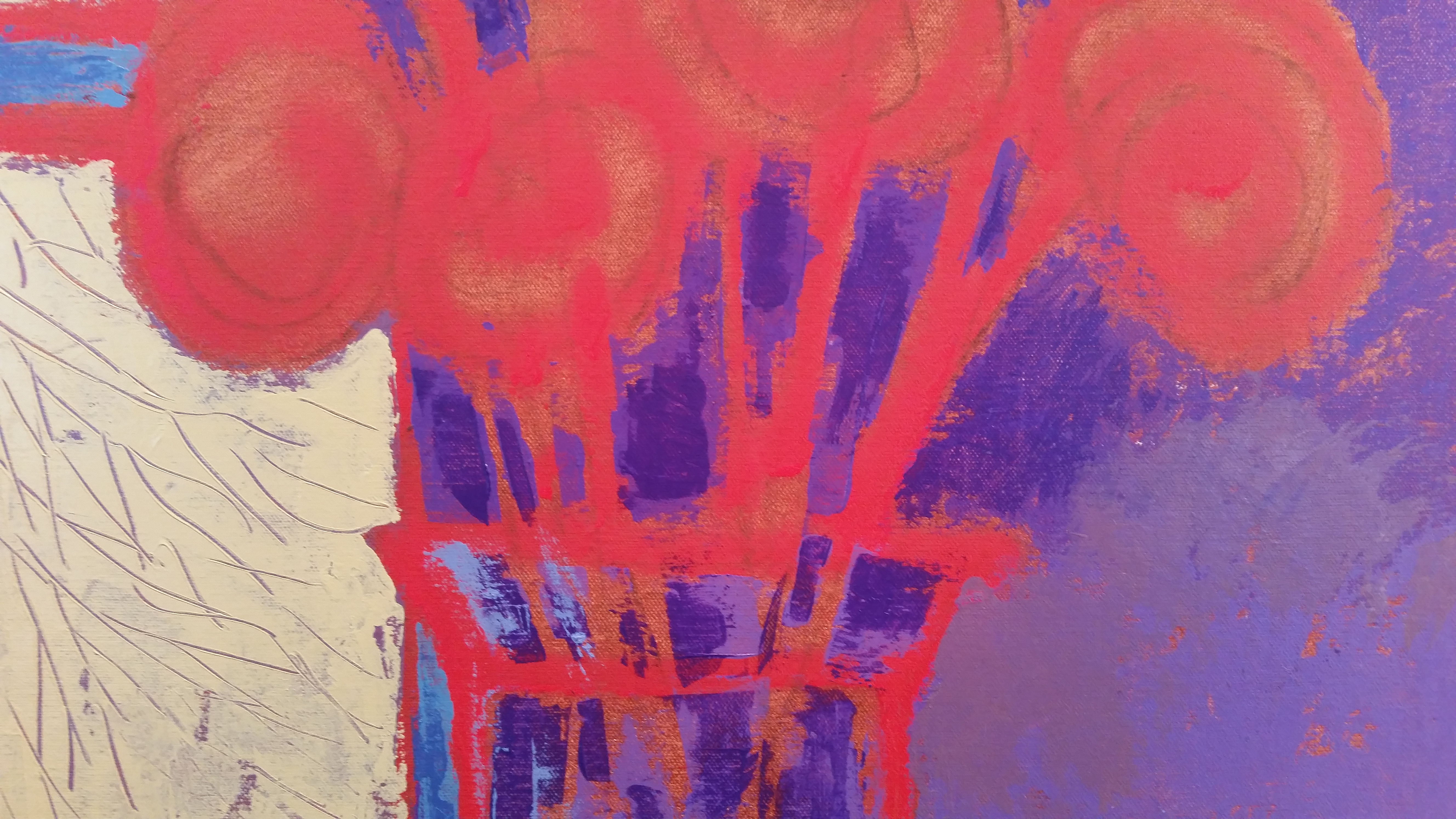
Loose canvas pinned to my studio wall with lines painted with acrylic to define the design and determine boldest shapes, size 54×36.
Sometimes going bigger is the way to go. And the fishermen in ‘Jaws’ would surely agree. After exploring many boat paintings in a smaller format I decided now was the time to go bigger and see what happens. How would my process change and decisions that I make along the way be different than decisions made in smaller formats.

24×12 Preliminaries for the bigger boat painting. These helped determine a color scheme and how a vertical format would feel.
The red underpainting adds a unifying tone to subsequently painted colors. It is not intended as a final image color but will peek through painted areas and hopefully bring a sparkle-like effect as simultaneous colors vibrate against one another. The painting on the lower left began with a red undertone and the one on the right began with a white undertone. Watching these colors interact with each other during the painting process helps me determine what colors I will use next in the early stages of painting.

A limited color palette helped keep this process under control as I worked to find a color scheme that worked for me. Muted tones blended nicely as I worked from sketches as this setup was completely made up from my memory of hanging around the waterfronts. (For painters, I have used white duct tape strips to crop the painting so I could get a better look at the final size. I stuck the tape back-to-back to get reusable 3″ wide strips.)
There are many layers of paint on top of paint on this one as I tried various color combos. I like the texture of the build up of paint and don’t mind the roughness of the surface. Actually I try to achieve a non-smooth surface in most of my work. My paint strokes reinforce the directional thrust of my design directing the viewer where I’d like their eye to go. Of course this concept is not foolproof but I find people enjoy this idea.

Taking a long look at my progress as I pin this to the side of my house on a cloudy day to evaluate many aspects. Next step, on to the framer to be put on stretcher bars.
I enjoyed the process of working much larger and designing a piece that has bold forms to match the overall bigness of the piece. As you can see there is nothing delicate about this work but I do like the way the muted colors provide a foundation for the deep blues as they define surfaces.
Lesson learned: If you never try it, you’ll never know.
NOTE: This final painting ‘Beyond the Blue’ will be on display at the New Hampshire Art Association ‘Visions’ exhibit, opening reception on May 6th, 2016 through 28th. My painting series in this show is titled, ‘Along the Waterfront’, 15 new works of various sizes. Levy Gallery, State Street, Portsmouth, NH.

Mar 24

Life Tapestry, 52×52, acrylic and fabric on canvas
Some artworks take on a life of their own where they are directing you instead of you directing them. This one is a perfect example. I thought I would do a large piece of a couple walking together toward the woods with light coming through tree branches. Probably using fairly realistic colors and imagery. As I was working my mind went toward a larger idea of ‘lifetime’ and how we all experience different things that add up to our unique experience in life.
I believe because I had been experimenting with fabrics for other works the idea of using the colored swatches at the left of this painting to suggest the colorful experiences of life crept into my psyche as I worked on this piece. It became a focal area and a complement to the verticality of the trees. I repeated colors into the tree branches to echo the swatches. The two figures are purposely secondary as their proportion to the bigness of their life is surprising. I hope we all get to feel that our lives have been well lived and well loved.
Lesson learned during this process, I need to talk with my work to find out how things are going. It’s probably not going where I thought at the beginning. And its ok.

Jan 10

Changing my mind early on before I go too far
Sketchbook work is the foundation for almost all of my paintings. I depend on small scale sketches to discover the design foundation of each piece before I proceed to finish–or at least that is my plan. But sometimes just a few lines on a canvas derails even the most promising sketch. Here is a good example. The black lines–done first just didn’t make as strong a design as I hoped when I scaled up from a thumbnail to this 18×18. I first sketched on the grey gessoed canvas surface with soft charcoal, then added fluid black acrylic to further solidify my design.
Then I sat back in my comfy yellow stuffed swivel chair given to me by a painter friend, the wonderful watercolor painter, Judy S. McLean. These few black lines on the canvas quickly voiced their opinion that I was NOT to proceed any further. Think again they said. Try another sketch today. Don’t you just hate pushy sketchbook voices? So, I went back to my sketchbook, flipped a page or two and out jumped a much better idea to pursue.
I then flipped the black line painted painting upside down and grabbed my white fluid acrylic paint bottle and drew the white lines right on top. This was a better start and I felt able to continue with the process toward the finish line. You can still see some of the white lines in final piece below.

Coming Through, 18×18, acrylic on canvas
Lesson learned through this particular painting process was to be decisive when I feel something is amiss. Being honest with yourself as an artist and letting your intuition guide your moves will improve your chances of finishing strong.
How do you solve your painting design issues? I’d love to hear from you.


Repeatedly, acrylic and fabric on canvas, 24×24
And so ends 2015, a tough year with losing elder family members, illnesses, and generally a sense of starts and stops, of undecidedness (is that a word?) Ever the optimist I look forward to 2016 with a renewed sense of hope for peace in the world, good health for all, and the ability to work on my art to create with the gifts God gave me. Blessings to you all for a Happy New Year.
The artwork above is a defining piece created late 2015 that combines my ideas of using recycled material, weaving together family and friends, finding the abstract imagery that speaks to my soul, and boldly going where I have never gone before. I know I know. It’s Star Trek not Star Wars. Cheers to 2016.

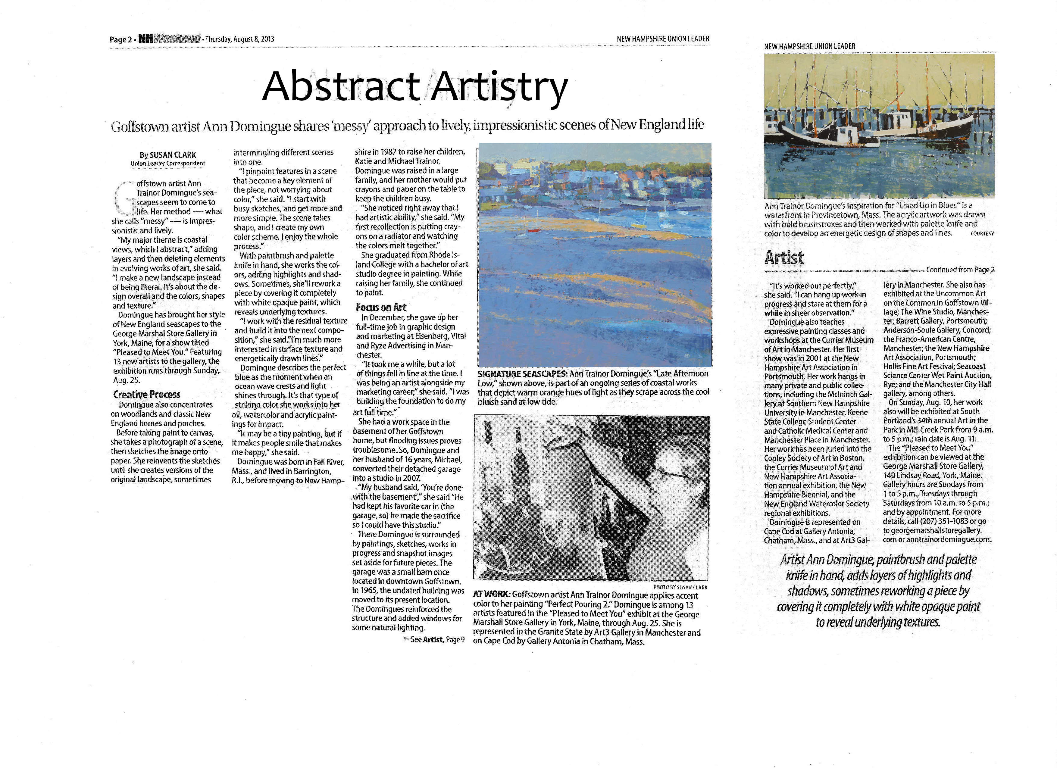
Raking Light, 36×36 acrylic on canvas, sold
Have you ever noticed how artists produce one art piece and then continue to use that same underlying design to produce many more pieces based on that same idea? If you have noticed this, thank you. It is one important way artists, in my case painter, build out from the original idea to develop new work.
In this blog post I am using my piece titled ‘Raking Light’, 36×36, acrylic 2013 to demonstrate this idea. A snapshot I took in Provincetown, MA many years ago was the spark or gift for this series. Beautiful late afternoon orange-yellow light positioned low in the sky lit up the crest of the curve of the harbor beach along with small sailboats that were sitting on the mudflats and floating in the deeper waters. The diagonal thrust of the painting from left to right and the warm orange yellow tones in proximity to the cooler lavenders was a glowing color combination that resonated quickly with a new collector. It was exhibited one time and sold. What a great feeling.
That sale influenced another commissioned piece of the same imagery at a different size using same color palette. This made sense to me and I began to understand that just because I painted an image once didn’t mean it made the imagery unrepeatable. It was the snapshot gift and one painting that keeps on giving. Now I see it as just the beginning. I learned what appealed to the buyers and went ahead and created new works based on this knowledge. Not copying– but analyzing what worked and further explored this knowledge in new versions.

Reflecting On Summer, 24×24 acrylic on canvas, sold
It may be the overall composition that is brought forward in a new work or simply color changes. In the case of ‘Reflecting On Summer’ 24×24 acrylic on canvas 2014, I focused a bit more on enlarging the pattern of the small boats in the same curved harbor shape. Color tones are also similar to the Raking Light piece.

After Dinner Walk, take 1.
In ‘After Dinner Walk’ a 36×36 acrylic on canvas 2015, I took a high key contrast take, shown above. But I was not satisfied with the result and revised it as the bright color contrasts were not resonating for me. See below.

After Dinner Walk, 36×36, acrylic and fabric on canvas. Final take.
The surface itself was built up with some fabric scraps to add more surface texture and change the imagery. I modified the figures walking along the beach to be more integrated with the whole landscape.
Also in 2015 ‘Looking Out’ 30×30 acrylic on canvas, (shown below) I utilized a higher color key using a bright green teal color in the focal area as well as a smoother surface texture. The color lends a more tropical feel to the harbor waters and the city-like ring of buildings brings a sense of a different location as well.

Looking Out, 30×30 acrylic on canvas, available
As I have shown here seemingly small changes can lead to large modifications and surely affects how a person relates to an art work. Simply going back to imagery that resonated with people has been a productive place for me to return to when thinking about what’s next on my studio wall.
If you have an experience with this idea as an artist or collector, I’d love to hear your thoughts.

Here are two recent articles about my art process. If you would like to know more, please ask or contact one of my galleries which you will find on my website at www.anntrainordomingue.com


Our local florist shop, Apotheca Tea Shoppe and Flowers in Goffstown, New Hampshire, allowed me to browse and spend an afternoon sketching and photographing (actually taking snapshots) of their beautiful displays of flowers. Quite a colorful afternoon it was. I was developing a new series paintings using flowers, florists, gardeners as my inspirations.

 In following with my decidedly unconventional approach to design and color, I was looking to work with the color, forms, patterns and textures in an uncommon way. A way that would have viewers say, hmmm, I’ve never seen that before. I was doing as much thinking as photographing and sketching during this process. I don’t begin a process like this with preconceived notions of what I am going to do with the information. What fun would that be? Of course I realize plenty of artists pre-think and I find myself overthinking frequently. But this time I tried NOT to solve the puzzle ahead of time.
I am a bit demanding of my muse–whenever she shows up–I want to have plenty of input for her to work with. A couple of the florists at the shop wound up being part of my inquiry as well although not my intention of using them in this work. But I never know. Even the worst photo can offer the best idea for a painting.
The photos shown above are great as a reference for shapes, colors, flower angles, reflections and refractions of stems through glass. Not perfect lighting conditions for copying exactly what is shown but more than enough information for me to use to incorporate into a fresh design.
The concept of design is first and foremost in my mind when I approach new work. I enjoy the quick process of sketching possibilities for a larger piece. I feel at during this stage I am efficiently running through ideas before I ‘waste’ time working large on a weakly designed idea. Again my background in graphic design and advertising concepts fit seamlessly into my process.
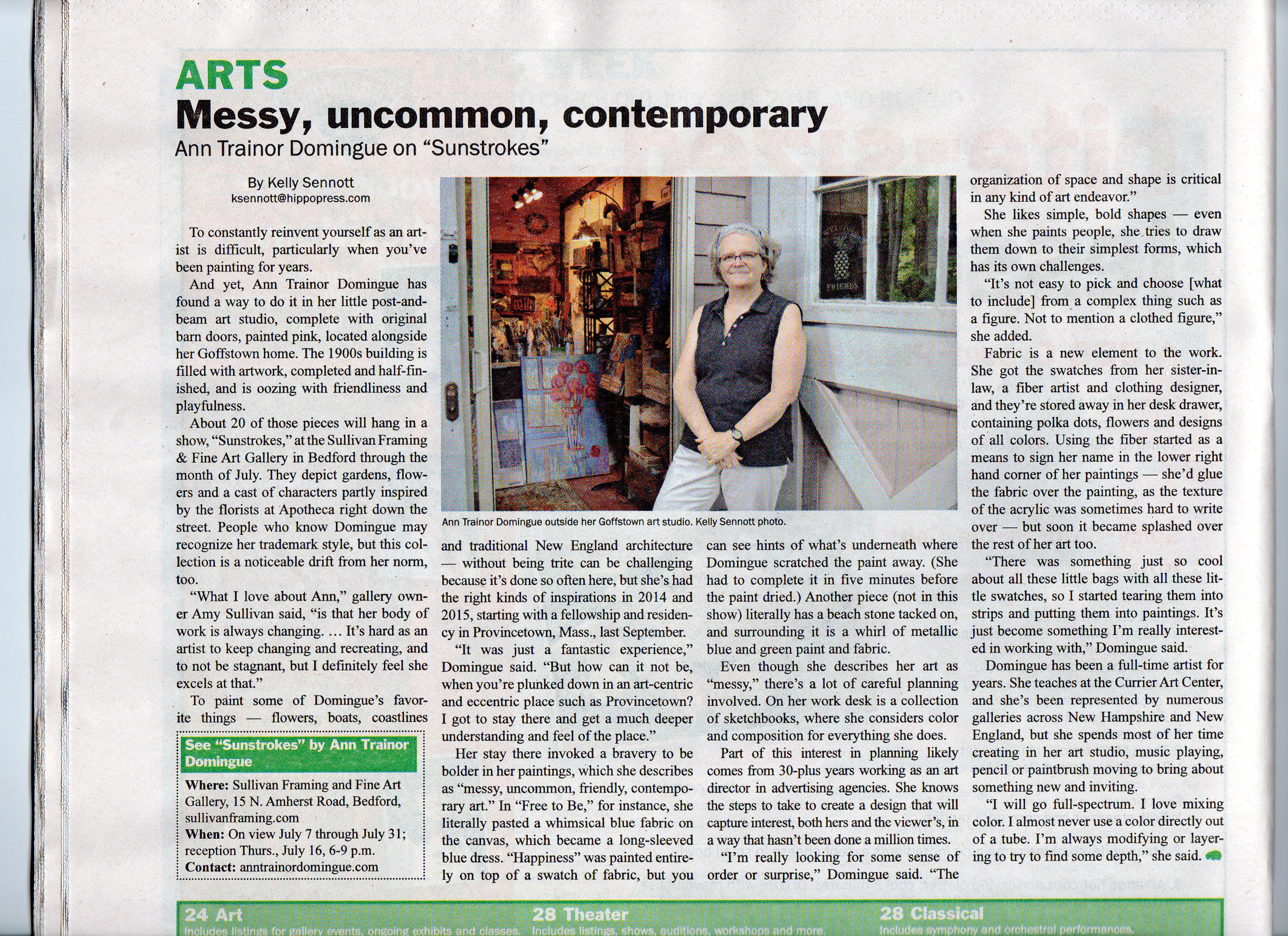
The final artwork shown below was inspired by this process along with twenty others for a recent show titled, ‘Sunstrokes’. Less detail, sketchy in its application of paint. Not looking labored over. Fresh. Direct. Friendly.
Can’t wait to get back to the studio.
(‘Redheads’, 12×12, acrylic on panel, available at Sullivan Framing, Bedford, NH.)


Quick note about starting a new painting series while retaining some of your current art work elements.

Messy, uncommon, friendly contemporary landscape paintings inspired by the New England landscape
Good News from A Great City Haverhill, MA
Scanning the world through a marketer's eyes and sometimes just regular old human eyes.
Messy, uncommon, friendly contemporary landscape paintings inspired by the New England landscape
Messy, uncommon, friendly contemporary landscape paintings inspired by the New England landscape
Messy, uncommon, friendly contemporary landscape paintings inspired by the New England landscape
Messy, uncommon, friendly contemporary landscape paintings inspired by the New England landscape
Insights about my messy, uncommon, friendly contemporary art
Messy, uncommon, friendly contemporary landscape paintings inspired by the New England landscape
Messy, uncommon, friendly contemporary landscape paintings inspired by the New England landscape

