Skip to content

Posts tagged ‘painting’

Delicately Powerful

Our local florist shop, Apotheca Tea Shoppe and Flowers in Goffstown, New Hampshire, allowed me to browse and spend an afternoon sketching and photographing (actually taking snapshots) of their beautiful displays of flowers. Quite a colorful afternoon it was. I was developing a new series paintings using flowers, florists, gardeners as my inspirations.

gerber redspeonies In following with my decidedly unconventional approach to design and color, I was looking to work with the color, forms, patterns and textures in an uncommon way. A way that would have viewers say, hmmm, I’ve never seen that before. I was doing as much thinking as photographing and sketching during this process. I don’t begin a process like this with preconceived notions of what I am going to do with the information. What fun would that be? Of course I realize plenty of artists pre-think and I find myself overthinking frequently. But this time I tried NOT to solve the puzzle ahead of time.

I am a bit demanding of my muse–whenever she shows up–I want to have plenty of input for her to work with. A couple of the florists at the shop wound up being part of my inquiry as well although not my intention of using them in this work. But I never know. Even the worst photo can offer the best idea for a painting. 

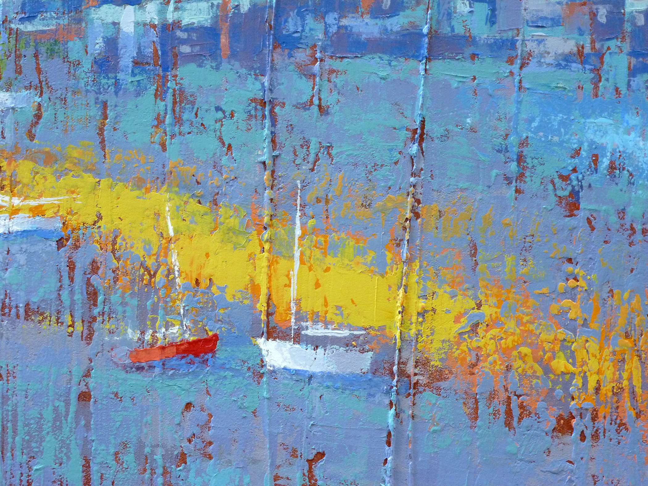
The photos shown above are great as a reference for shapes, colors, flower angles, reflections and refractions of stems through glass. Not perfect lighting conditions for copying exactly what is shown but more than enough information for me to use to incorporate into a fresh design.

sketches20150306_125047     20150306_151725

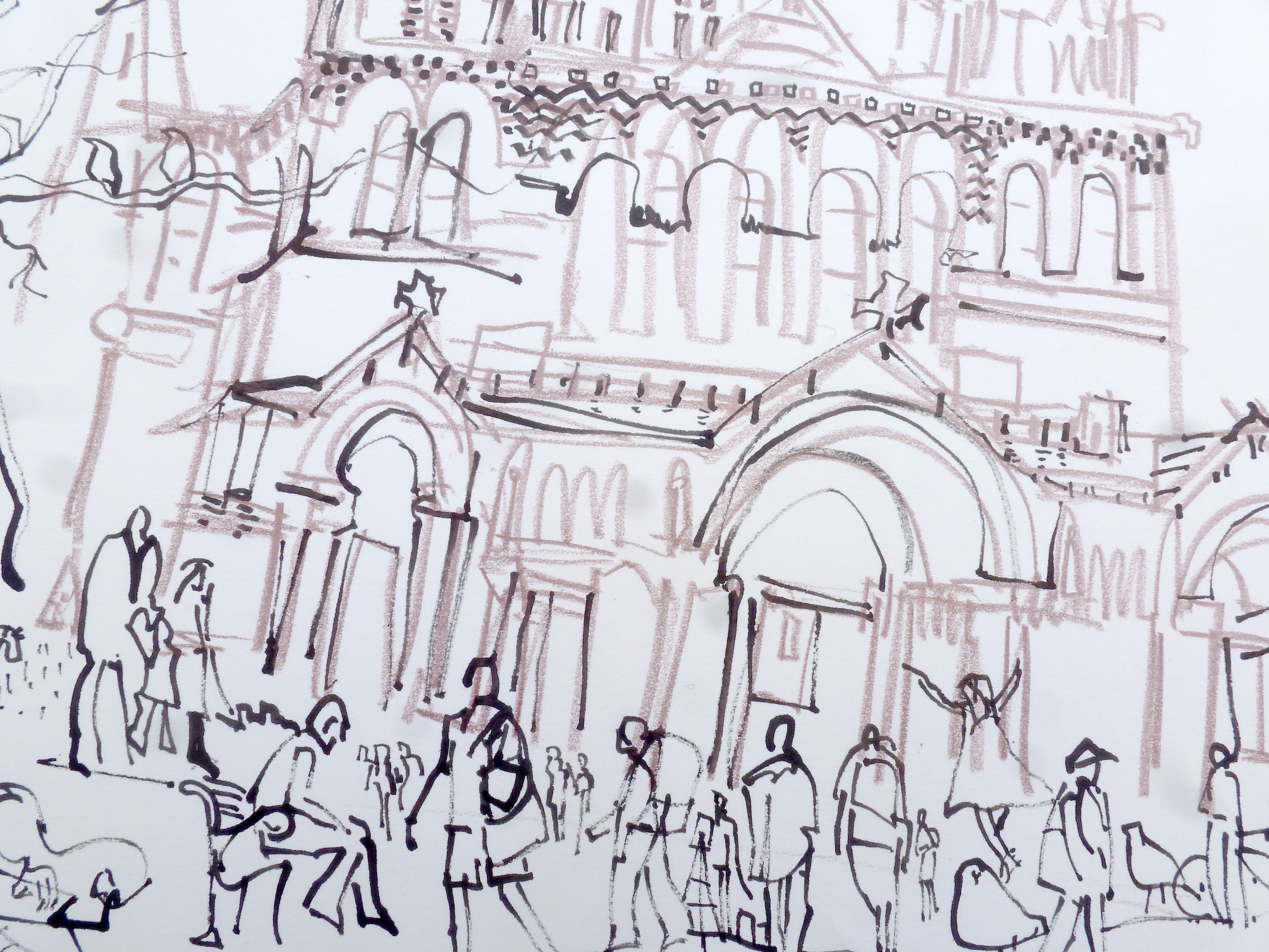
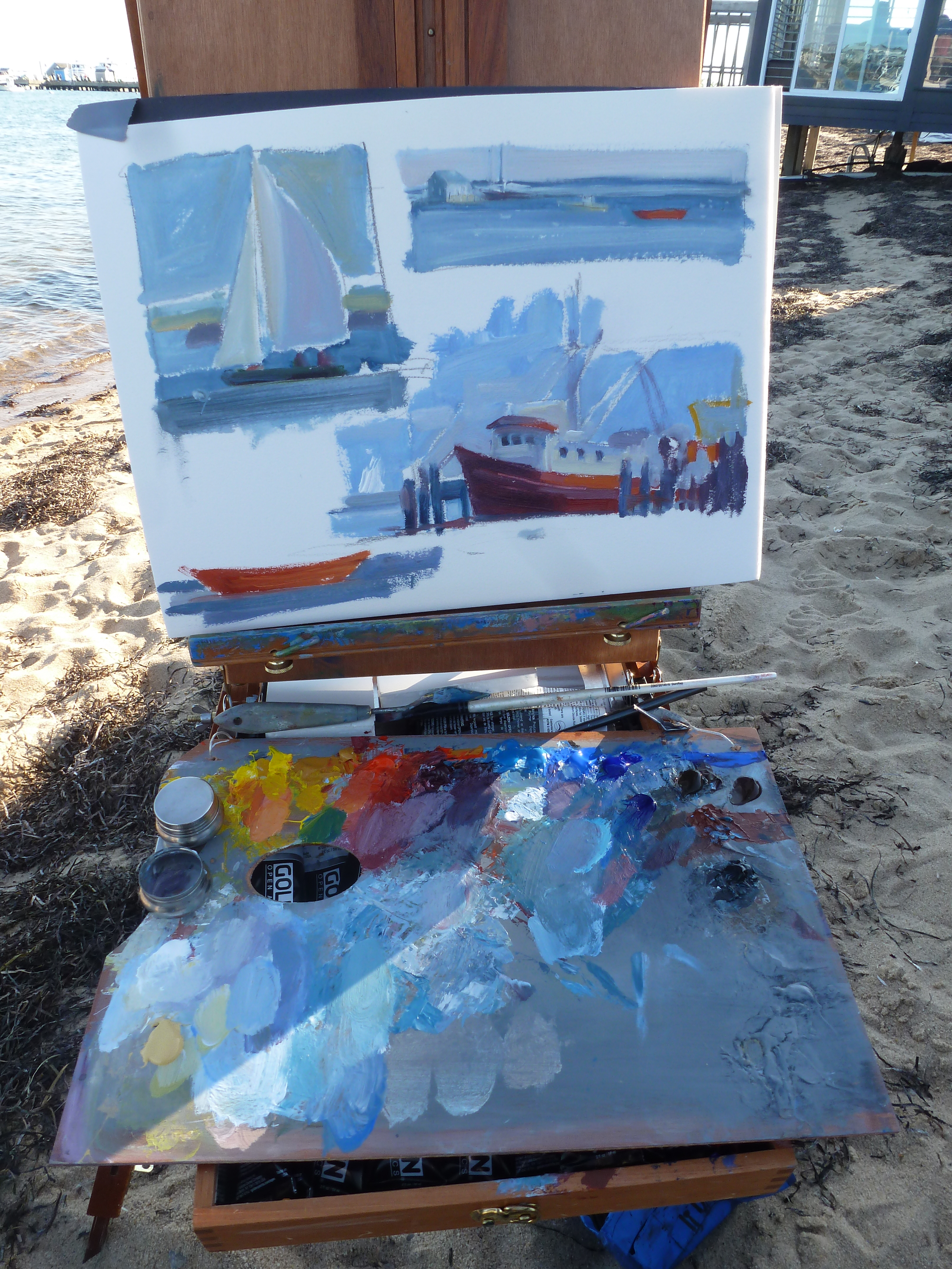
The concept of design is first and foremost in my mind when I approach new work. I enjoy the quick process of sketching possibilities for a larger piece. I feel at during this stage I am efficiently running  through ideas before I ‘waste’ time working large on a weakly designed idea. Again my background in graphic design and advertising concepts fit seamlessly into my process.

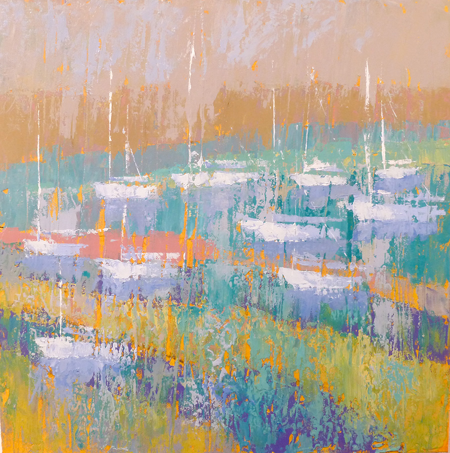
The final artwork shown below was inspired by this process along with twenty others for a recent show titled, ‘Sunstrokes’. Less detail, sketchy in its application of paint. Not looking labored over. Fresh. Direct. Friendly.

Can’t wait to get back to the studio.

(‘Redheads’, 12×12, acrylic on panel, available at Sullivan Framing, Bedford, NH.)

15407 Redheads acryl fabr canv 12x12 sm

One Red Boat, Endless Painting Options

As artists we are always on the look out for things that capture our attention. We may not know what we are going to do with that little tidbit at the moment but we file it away for future use. And yes, we forget about them sometimes. But as an individual artist we tend to notice similar things, over and over. And therein lies the key.

Very coarsely-painted beginning

Very coarsely-painted beginning

Not sure who said it but “notice what you notice” is such a great statement. Especially if you are an artist looking for direction. Randomness is not an asset when it comes to defining who you are as an artist. Maybe at a later more experienced point it will be, but not at the outset. Looking intensely at a series of photos you’ve taken, making notes of what interests you in the landscape or people-scapes around you. Look for the pattern created when you go out for a walk–are you looking at minute details of flowers, or rolling hillsides, or how the light shines through the woods. The sooner you find your personal pattern, the more directed you can be in your artistic development.

Using the rough sketch to develop painting design further

Using the rough sketch to develop painting design further

For me, the coastal waterfront and all its details have been at the very top of my list. Early on impressive sunrises and sunsets were at the very top. I loved them, but did not necessarily want to paint about them. So many people were already doing that. I wanted to paint about things differently and add something that gave the viewer more information about the things I find important.

A red-colored work boat in Provincetown harbor provided the needed intensity to dive into this subject in various ways and create some final paintings. Even after many years I am still intrigued by this working pier in Provincetown. The activity, the aged boats that still work every day, the people who go out on the sea day after day–I admire them for their bravery. I once thought I would like that life but have since come to my senses. Seasickness and I are companions unfortunately but I still love being on the water when I can. So even a landlubber can have great appreciation for things connected to the sea. I have plans to explore this motif and weave in some themes of connectedness, friendship and awe. To be continued…

Closeup look at detail of a 24x24 painting depicting the simple drama of red against blues.

Closeup look at detail of a 24×24 painting depicting the simple drama of red against blues.

Springtime Sketching in Boston

comparison May 2015 Trinity Church May 2015

In a city like Boston, there are so many beautiful options for sketching and painting that it takes quite some time to make a decision. In a plein air event like this–painting direct from nature outdoors– painters must decide quickly where they will spend their day or risk running out of time. For a painter, the chance of losing the shadows or lighting conditions are what pressures us to settle on a view and get to work. I spent about 30 minutes walking near Trinity Church looking for a position detail of drawingthat gave a me a broad view of the main facade, was away from dangerous traffic, had some shade for me to sit in if need be, and was not located too far from the Copley Society of Art gallery in case nature called. I had great fun doing this piece although it was chilly and windy. Nice to hear that someone bid on this piece at the Auction held May 8th. Thank you to whoever you are. Visit my painting website at www.anntrainordomingue.com

Hazy, Hot and Humid Art

July comparison 2013

Who would have thought a stroll after a nice dinner at the Lobster Pot would have captivated my artistic eye for so long. A quick snapshot taken one hot afternoon in Provincetown, MA has been the catalyst of many of my recent artworks. As with many other photos I have taken, as soon as one painting is completed I have another idea to improve/change/renovate the next one. On this one, with the advice of Mary Harding curator of the George Marshall Store Gallery in York, Maine, to “paint bigger” here is the results. Raking Light Across at 36×36 gave me the space and opportunity to really dig in and work on the layering of color and texture. It was a blast. More to come.

Textured Cold Reds

Another day another painting for the 30/30 painting challenge presented by Leslie Saeta, http://lesliesaeta.blogspot.com/
Playing with tones of cold, snowy New Hampshire–red branches of shrubs, cold shadows, light snow. Instead of rendering an exact copy of this scene, I am working to abstract essential details to create this 5×7 painting, acrylic on paper with red and white ink. 20150112_165444_resized

In With the New

patterns in the underbrush

Between the Seasons, 24×24, acrylic on panel

Seasonal transitions in New England are not so subtle hints that change is in the offing. Temperatures rising or lowering dramatically, colors intensifying or diminishing, textures smoothing or coarsening, sounds echoing or softening. Heading into winter or welcoming spring are the transitions that I look forward to each and every year. They find their way into my artworks in both subtle and obvious ways through more vibrant or subdued colors, understated or bolder forms, quieter or busier textures, and complex or simplified patterns. This particular painting known as Coming Solstice or Between the Seasons is a reflection on the landscape forms that surround me as well as my use of them in building a painting. It is the start of a new season and this approach will be the beginning of a new series of work for 2015. Hope you have great things on tap for the coming New Year.

Gravity of Grays

P1130888

I love grays–they are very important colors–foggy, charcoal, steel, cool, warm, and Cape Cod grays. But what I really like in this snapshot is how gray creates background tones that contrast beautifully with all kinds of colors. From turquoise to soft peach to warm orange as in this photo. The various tones of grays of the shingles, boats, sand and misty air all combined to form an unusual color combination and one that I will be exploring in my paintings this winter.

Copley Society Artist Residency at Fine Arts Work Center in Provincetown, MA

Using golden Open acrylics--longer time to dry that traditional acrylics. Work quite well.

Plein air painting as the tide gets closer to my feet.

As I catch up with my necessary duties as an artist (marketing, organizing, packing, shipping, emailing, inventorying, etc.), I am itching to get back in the studio to explore and play with the exciting new approaches to my art I discovered during my month-long residency at FAWC in Provincetown on Cape Cod. From toying with more abstract thinking to working without references, from meeting new faces to meeting famous faces–Paul Resika, Berta Walker, Constantine Manos–I have so much to internalize about my experience. Good thing the winter hibernation season is coming soon. Not that I hibernate of course. But those nice quiet snowfalls will be perfect backdrop as I dig deep into my thoughts.

Spirit of Grit / In the City

Spirit of Grit, In the City

Final painting revised months after I thought it was complete.

As a Copley Artist member I have an opportunity to submit artwork to planned exhibitions. Most recently a call for entries arrived called “GRIT-the urban landscape”. I almost dismissed the idea of entering as my work usually is nature-based with simple structures–certainly not gritty and city-based. The more I thought about it the more I was intrigued by the idea of taking this theme and interpreting it my own way.

version 1

First effort: 48″x24″ Black, grays and touches of warm tones as taillights or street lines.

version 2 48"x24"

Second effort on top of first effort.

My first attempt to sort out my approach is shown here a the left. Bold structure-like forms with window shapes and reflections interconnecting and overlapping in a similar way to how my brain feels when I go into any city especially for the first time. I may a well have jumped into the middle of a weaving loom full of threads and been asked to organize the colors and lines to find my way. Complete overload. Here was one way of visualizing that sensation. I stared at it for a while, overnight too. But it wasn’t speaking loudly enough to me.

In effort 2, I began the process of somehow enriching the experience in a way that made it more complex. Adding lines and areas of color that created a sense of evening, introduces a curved-dome suggesting a church, introduced an intense color area at the bottom suggesting the street level where most of the color happens. And of course added a suggeston of the Zachem bridge in the background.

Another day and night goes by as I evaluate it’s chances of seeing the light of a gallery wall. It could have been a keeper, but I was not satisfied yet. Out came the scrub brush. (I have heard many friends say you wiped that out? I love  that one! How could you? Ughh. It is after all my sense of what is right…right?)  After hours of work it is always a tough decision to either keep it, rework it, or completely smudge and smear til it gets to a point where I feel I have a base to move ahead again.

After the scrub

Third effort: Boldly applied acrylic now creates repeat pattern and underlying structure or foundation for me to play. You’ll notice the final painting is rotated 180 degrees from this version.

And so away it went. Scrubbed into a neutral blue gray gritty-looking background of texture and color. Now that was a surface I could work with. What did I want to say about the city? I am always impressed by the color as it contrasts with the stone grays of building materials found all over any city. Granite, limestone, pavement, cement, dust, dirt, smoke, hazy skies, misty air. Then there are the signs–retail, traffic, business, sandwich boards, all vying for attention while creating a cacophony of noise and distraction and confusion. That’s what I’ll paint about. And while I’m at it I’ll rotate the painting canvas to a bold horizontal where the expanse sideways will be as powerful as the vertical thrusts of the building/street lines. Now we’re talking. Me and my canvas.

detail of Spirit of Grit

Detail of process pic of Spirit of Grit.

I selected complementary colors of oranges and reds to contrast with the blues of the background hoping to heighten the busyness effect of the concept. A night and day notion–where there doesn’t seem to be much difference when living in the city–is represented by the dominant white building/street/subway-like line through the middle linking foreground and background imagery. Curves of a sky area reflects into a waterway representing moonlight blue evening sky. Traffic signal light at lower left adds a playful bit of color suggesting stopping, slowing and going are all part of the city life.

Hope you’ve enjoyed this glimpse into my process no matter where you thought I should have stopped. Now I must go…

Painting on top of a painting. Almost final...

Painting on top of a painting. Almost final…

Edit October 2014: After looking at this piece, I decided it needed more work. The top image of this post reflects the new final piece.

← Back

Thank you for your response. ✨


Details Inspire Large Work

High key colors in body ofwater with small sailboat imagery

Playing with heavy textures in my customary coastal theme.

Last summer I did a painting titled, Raking Light, a 36×36 that described a late afternoon low tide at a sandy beach in Provincetown. One small area of the painting approx. 5×5  inspired this enlargement at 24×24. I loved how the coarseness of the under-texture allowed the acrylic paint to sit up on top of the raised areas. And adding other color layers allowed those underneath to still peek through. Having fun creating new works this endless winter using this idea. No title as of yet. Ideas?

Detail that inspired new work

Detail that inspired new work

Ann Trainor Domingue art

Messy, uncommon, friendly contemporary landscape paintings inspired by the New England landscape

The Heartbeat of Haverhill

Good News from A Great City Haverhill, MA

Brain4Rent's Blog

Scanning the world through a marketer's eyes and sometimes just regular old human eyes.

Art Biz Success

Messy, uncommon, friendly contemporary landscape paintings inspired by the New England landscape

RedDotBlog

Messy, uncommon, friendly contemporary landscape paintings inspired by the New England landscape

Mary Byrom

Messy, uncommon, friendly contemporary landscape paintings inspired by the New England landscape

TODD BONITA'S ART BLOG

Messy, uncommon, friendly contemporary landscape paintings inspired by the New England landscape

Ann Trainor Domingue Art Blog

Insights about my messy, uncommon, friendly contemporary art

The Art Law Blog

Messy, uncommon, friendly contemporary landscape paintings inspired by the New England landscape

Urban Sketchers

Messy, uncommon, friendly contemporary landscape paintings inspired by the New England landscape