‘Along the Waterfront’ opens Friday

May 2

Loose canvas pinned to my studio wall with lines painted with acrylic to define the design and determine boldest shapes, size 54×36.
Sometimes going bigger is the way to go. And the fishermen in ‘Jaws’ would surely agree. After exploring many boat paintings in a smaller format I decided now was the time to go bigger and see what happens. How would my process change and decisions that I make along the way be different than decisions made in smaller formats.

24×12 Preliminaries for the bigger boat painting. These helped determine a color scheme and how a vertical format would feel.
The red underpainting adds a unifying tone to subsequently painted colors. It is not intended as a final image color but will peek through painted areas and hopefully bring a sparkle-like effect as simultaneous colors vibrate against one another. The painting on the lower left began with a red undertone and the one on the right began with a white undertone. Watching these colors interact with each other during the painting process helps me determine what colors I will use next in the early stages of painting.

A limited color palette helped keep this process under control as I worked to find a color scheme that worked for me. Muted tones blended nicely as I worked from sketches as this setup was completely made up from my memory of hanging around the waterfronts. (For painters, I have used white duct tape strips to crop the painting so I could get a better look at the final size. I stuck the tape back-to-back to get reusable 3″ wide strips.)
There are many layers of paint on top of paint on this one as I tried various color combos. I like the texture of the build up of paint and don’t mind the roughness of the surface. Actually I try to achieve a non-smooth surface in most of my work. My paint strokes reinforce the directional thrust of my design directing the viewer where I’d like their eye to go. Of course this concept is not foolproof but I find people enjoy this idea.

Taking a long look at my progress as I pin this to the side of my house on a cloudy day to evaluate many aspects. Next step, on to the framer to be put on stretcher bars.
I enjoyed the process of working much larger and designing a piece that has bold forms to match the overall bigness of the piece. As you can see there is nothing delicate about this work but I do like the way the muted colors provide a foundation for the deep blues as they define surfaces.
Lesson learned: If you never try it, you’ll never know.
NOTE: This final painting ‘Beyond the Blue’ will be on display at the New Hampshire Art Association ‘Visions’ exhibit, opening reception on May 6th, 2016 through 28th. My painting series in this show is titled, ‘Along the Waterfront’, 15 new works of various sizes. Levy Gallery, State Street, Portsmouth, NH.


Repeatedly, acrylic and fabric on canvas, 24×24
And so ends 2015, a tough year with losing elder family members, illnesses, and generally a sense of starts and stops, of undecidedness (is that a word?) Ever the optimist I look forward to 2016 with a renewed sense of hope for peace in the world, good health for all, and the ability to work on my art to create with the gifts God gave me. Blessings to you all for a Happy New Year.
The artwork above is a defining piece created late 2015 that combines my ideas of using recycled material, weaving together family and friends, finding the abstract imagery that speaks to my soul, and boldly going where I have never gone before. I know I know. It’s Star Trek not Star Wars. Cheers to 2016.

Raking Light, 36×36 acrylic on canvas, sold
Have you ever noticed how artists produce one art piece and then continue to use that same underlying design to produce many more pieces based on that same idea? If you have noticed this, thank you. It is one important way artists, in my case painter, build out from the original idea to develop new work.
In this blog post I am using my piece titled ‘Raking Light’, 36×36, acrylic 2013 to demonstrate this idea. A snapshot I took in Provincetown, MA many years ago was the spark or gift for this series. Beautiful late afternoon orange-yellow light positioned low in the sky lit up the crest of the curve of the harbor beach along with small sailboats that were sitting on the mudflats and floating in the deeper waters. The diagonal thrust of the painting from left to right and the warm orange yellow tones in proximity to the cooler lavenders was a glowing color combination that resonated quickly with a new collector. It was exhibited one time and sold. What a great feeling.
That sale influenced another commissioned piece of the same imagery at a different size using same color palette. This made sense to me and I began to understand that just because I painted an image once didn’t mean it made the imagery unrepeatable. It was the snapshot gift and one painting that keeps on giving. Now I see it as just the beginning. I learned what appealed to the buyers and went ahead and created new works based on this knowledge. Not copying– but analyzing what worked and further explored this knowledge in new versions.

Reflecting On Summer, 24×24 acrylic on canvas, sold
It may be the overall composition that is brought forward in a new work or simply color changes. In the case of ‘Reflecting On Summer’ 24×24 acrylic on canvas 2014, I focused a bit more on enlarging the pattern of the small boats in the same curved harbor shape. Color tones are also similar to the Raking Light piece.

After Dinner Walk, take 1.
In ‘After Dinner Walk’ a 36×36 acrylic on canvas 2015, I took a high key contrast take, shown above. But I was not satisfied with the result and revised it as the bright color contrasts were not resonating for me. See below.

After Dinner Walk, 36×36, acrylic and fabric on canvas. Final take.
The surface itself was built up with some fabric scraps to add more surface texture and change the imagery. I modified the figures walking along the beach to be more integrated with the whole landscape.
Also in 2015 ‘Looking Out’ 30×30 acrylic on canvas, (shown below) I utilized a higher color key using a bright green teal color in the focal area as well as a smoother surface texture. The color lends a more tropical feel to the harbor waters and the city-like ring of buildings brings a sense of a different location as well.

Looking Out, 30×30 acrylic on canvas, available
As I have shown here seemingly small changes can lead to large modifications and surely affects how a person relates to an art work. Simply going back to imagery that resonated with people has been a productive place for me to return to when thinking about what’s next on my studio wall.
If you have an experience with this idea as an artist or collector, I’d love to hear your thoughts.

Here are two recent articles about my art process. If you would like to know more, please ask or contact one of my galleries which you will find on my website at www.anntrainordomingue.com


On the road toward Dunbarton, NH
Early springtime in New Hampshire has been gorgeous. If you are a fan of subtle color combinations playing off warm woodland neutrals, accented with brilliant blue sky and fresh green grasses, then you must be in heaven. These conditions don’t last very long but this year a dry April has allowed us a longer time to view the subtleties of spring. Now on to the vibrance of summer. #painting #anntrainordomingue #art #newhampshire

As painters know it takes a lot of practice to find your “voice” as an artist. My goddaughter Grace pictured in this sketch is learning to play guitar. She already has a good feel and her fingers confidently pluck the strings while suffering a bit while learning barr chords. She’ll stick with it I’m sure. And so will I as I discover new things during this 30 paintings/30 days challenge presented by Leslie Saeta on her blog, http://www.lesliesaeta.blogspot.com Soft pencil on lightweight sketch paper.

Next drawing/painting for the 30/30 Challenge on Leslie Saeta’s blog, an artist/blogger whose work I really admire. This is piece is 5×7 done with Ebony Pencil.


Here is one of those things that happens when you least expect it. Our first meeting was at the Thrift Store as we were selecting items to outfit our studios. Ilona was trying to squeeze through a narrow hallway in the shop and I moved to let her go by. Just that little courtesy was enough to have her comment on what a nice person I was. I was more impressed with the energy of this little lady as she worked her way around the shop and gathered her treasures to have the cashier take her money–all of 3.50 I believe. Then she donates several small coin pouches which she is lightening her load as she is packing to go back to New York for the winter. What a memorable experience and we have only been in Ptown for two days.
Next we head to a life drawing class at the Provincetown Art Association Museum (PAAM) a beautiful facility with many famous artworks by historic painters here on the Cape–Charles Hawthorne, Henry Hensche, Franz Kline, Paul Resika to name a few. And in walks Ilona, who will draw and moderate the timing for the life drawing session. Perfect timing, all business, and ends the class by letting us know this is her last session as she is heading back to NYC. I couldn’t stand it any longer, I has to get a photo with her and some of the class members were kind enough to take the shots. As you can see Ilona is a hoot. Had to fix her bright orange hair before the photo was taken–not sure I can tell the difference but more importantly she could. And adjust her extra long false eyelashes. At age 94–yes 94–she could out think any one of us. She is a well known character around here and we (Barbara Greenstein, another Copley Fellow also in the pic on the right) are very pleased to have met her. If this is a sign of things to come, we can now see that our experience will be way more than what meets the eye.


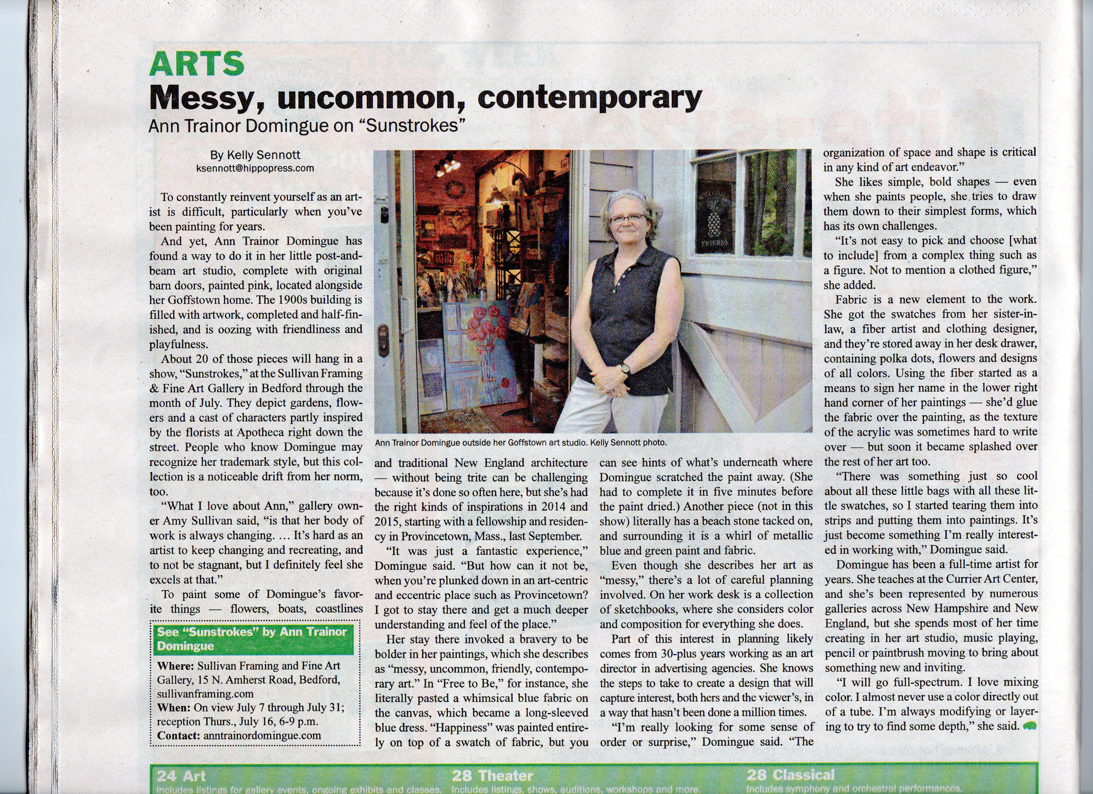
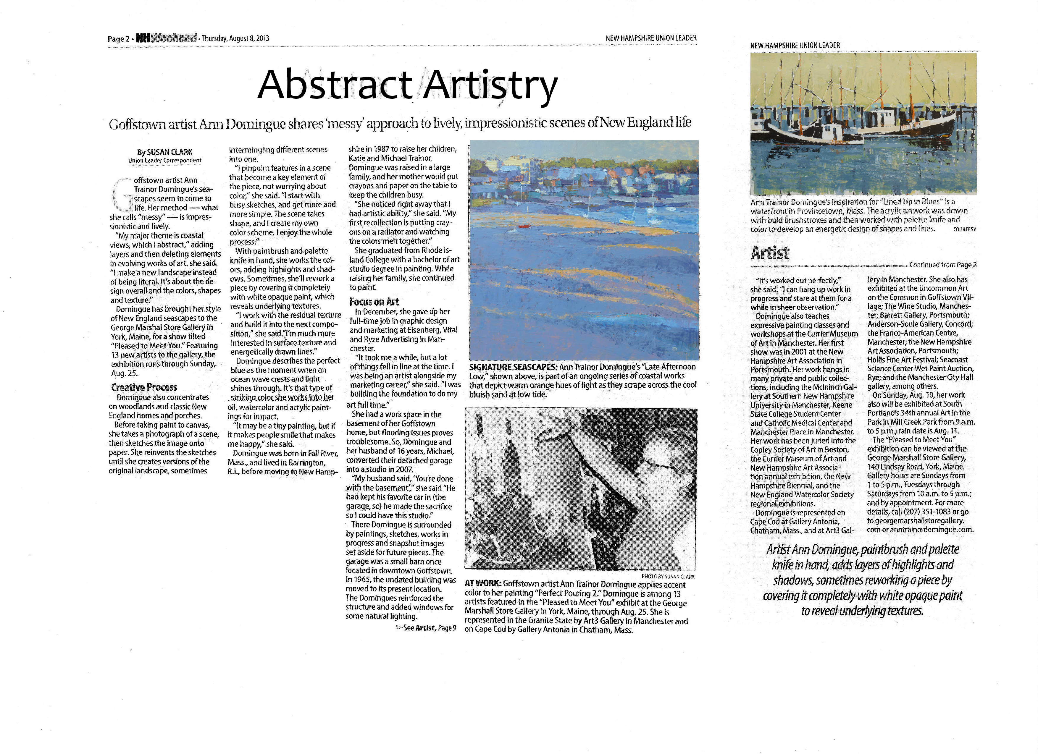
Messy, uncommon, friendly contemporary landscape paintings inspired by the New England landscape
Good News from A Great City Haverhill, MA
Scanning the world through a marketer's eyes and sometimes just regular old human eyes.
Messy, uncommon, friendly contemporary landscape paintings inspired by the New England landscape
Messy, uncommon, friendly contemporary landscape paintings inspired by the New England landscape
Messy, uncommon, friendly contemporary landscape paintings inspired by the New England landscape
Messy, uncommon, friendly contemporary landscape paintings inspired by the New England landscape
Insights about my messy, uncommon, friendly contemporary art
Messy, uncommon, friendly contemporary landscape paintings inspired by the New England landscape
Messy, uncommon, friendly contemporary landscape paintings inspired by the New England landscape


