Skip to content

Posts from the ‘painting’ Category

Daylily Play

This small format painting is a warmup for a new floral series I am working on for 2015. Bold black lines in acrylic paint define the flower shapes on paper and color was added by layering Neocolor I by Caran D’Arche. 30 paintings in 30 days project presented by Leslie Saeta’s blog, http://www.lesliesaeta.blogspot.com/. Lily Play sm

Textured Cold Reds

Another day another painting for the 30/30 painting challenge presented by Leslie Saeta, http://lesliesaeta.blogspot.com/
Playing with tones of cold, snowy New Hampshire–red branches of shrubs, cold shadows, light snow. Instead of rendering an exact copy of this scene, I am working to abstract essential details to create this 5×7 painting, acrylic on paper with red and white ink. 20150112_165444_resized

Snowstorming

Staying focused on getting back to experimenting with new takes on recent works. Another entry for the 30/30 challenge project on the http://lesliesaeta.blogspot.com/ art blog. Obviously this one is weather-inspired although a self-portrait of a shivering me in the studio would be a funnier-looking piece.Snowstorming 5x7 acry on paper sm

Rose Play

I am doing a thirty paintings/thirty days challenge on the Leslie Saeta blog. Painting is a sample for upcoming workshop I am teaching in Goffstown, NH at Apotheca on Superbowl Sunday afternoon.

abstract drawing flower

In With the New

patterns in the underbrush

Between the Seasons, 24×24, acrylic on panel

Seasonal transitions in New England are not so subtle hints that change is in the offing. Temperatures rising or lowering dramatically, colors intensifying or diminishing, textures smoothing or coarsening, sounds echoing or softening. Heading into winter or welcoming spring are the transitions that I look forward to each and every year. They find their way into my artworks in both subtle and obvious ways through more vibrant or subdued colors, understated or bolder forms, quieter or busier textures, and complex or simplified patterns. This particular painting known as Coming Solstice or Between the Seasons is a reflection on the landscape forms that surround me as well as my use of them in building a painting. It is the start of a new season and this approach will be the beginning of a new series of work for 2015. Hope you have great things on tap for the coming New Year.

Gravity of Grays

P1130888

I love grays–they are very important colors–foggy, charcoal, steel, cool, warm, and Cape Cod grays. But what I really like in this snapshot is how gray creates background tones that contrast beautifully with all kinds of colors. From turquoise to soft peach to warm orange as in this photo. The various tones of grays of the shingles, boats, sand and misty air all combined to form an unusual color combination and one that I will be exploring in my paintings this winter.

Open House vs. Open Studio

Open Studio details November 8 & 9, 2014, 10-4. Open to the public, free. 50+ original New England-inspired acrylic paintings. Messy, uncommon, friendly contemporary paintings

Read more

Copley Society Artist Residency at Fine Arts Work Center in Provincetown, MA

Using golden Open acrylics--longer time to dry that traditional acrylics. Work quite well.

Plein air painting as the tide gets closer to my feet.

As I catch up with my necessary duties as an artist (marketing, organizing, packing, shipping, emailing, inventorying, etc.), I am itching to get back in the studio to explore and play with the exciting new approaches to my art I discovered during my month-long residency at FAWC in Provincetown on Cape Cod. From toying with more abstract thinking to working without references, from meeting new faces to meeting famous faces–Paul Resika, Berta Walker, Constantine Manos–I have so much to internalize about my experience. Good thing the winter hibernation season is coming soon. Not that I hibernate of course. But those nice quiet snowfalls will be perfect backdrop as I dig deep into my thoughts.

Spirit of Grit / In the City

Spirit of Grit, In the City

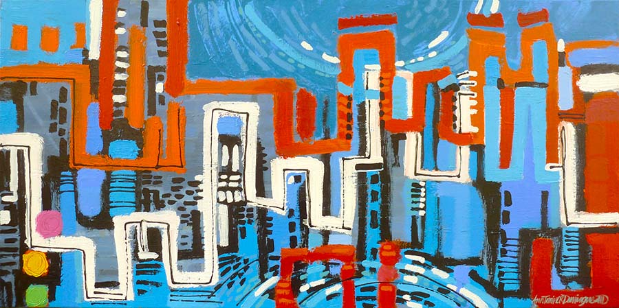
Final painting revised months after I thought it was complete.

As a Copley Artist member I have an opportunity to submit artwork to planned exhibitions. Most recently a call for entries arrived called “GRIT-the urban landscape”. I almost dismissed the idea of entering as my work usually is nature-based with simple structures–certainly not gritty and city-based. The more I thought about it the more I was intrigued by the idea of taking this theme and interpreting it my own way.

version 1

First effort: 48″x24″ Black, grays and touches of warm tones as taillights or street lines.

version 2 48"x24"

Second effort on top of first effort.

My first attempt to sort out my approach is shown here a the left. Bold structure-like forms with window shapes and reflections interconnecting and overlapping in a similar way to how my brain feels when I go into any city especially for the first time. I may a well have jumped into the middle of a weaving loom full of threads and been asked to organize the colors and lines to find my way. Complete overload. Here was one way of visualizing that sensation. I stared at it for a while, overnight too. But it wasn’t speaking loudly enough to me.

In effort 2, I began the process of somehow enriching the experience in a way that made it more complex. Adding lines and areas of color that created a sense of evening, introduces a curved-dome suggesting a church, introduced an intense color area at the bottom suggesting the street level where most of the color happens. And of course added a suggeston of the Zachem bridge in the background.

Another day and night goes by as I evaluate it’s chances of seeing the light of a gallery wall. It could have been a keeper, but I was not satisfied yet. Out came the scrub brush. (I have heard many friends say you wiped that out? I love  that one! How could you? Ughh. It is after all my sense of what is right…right?)  After hours of work it is always a tough decision to either keep it, rework it, or completely smudge and smear til it gets to a point where I feel I have a base to move ahead again.

After the scrub

Third effort: Boldly applied acrylic now creates repeat pattern and underlying structure or foundation for me to play. You’ll notice the final painting is rotated 180 degrees from this version.

And so away it went. Scrubbed into a neutral blue gray gritty-looking background of texture and color. Now that was a surface I could work with. What did I want to say about the city? I am always impressed by the color as it contrasts with the stone grays of building materials found all over any city. Granite, limestone, pavement, cement, dust, dirt, smoke, hazy skies, misty air. Then there are the signs–retail, traffic, business, sandwich boards, all vying for attention while creating a cacophony of noise and distraction and confusion. That’s what I’ll paint about. And while I’m at it I’ll rotate the painting canvas to a bold horizontal where the expanse sideways will be as powerful as the vertical thrusts of the building/street lines. Now we’re talking. Me and my canvas.

detail of Spirit of Grit

Detail of process pic of Spirit of Grit.

I selected complementary colors of oranges and reds to contrast with the blues of the background hoping to heighten the busyness effect of the concept. A night and day notion–where there doesn’t seem to be much difference when living in the city–is represented by the dominant white building/street/subway-like line through the middle linking foreground and background imagery. Curves of a sky area reflects into a waterway representing moonlight blue evening sky. Traffic signal light at lower left adds a playful bit of color suggesting stopping, slowing and going are all part of the city life.

Hope you’ve enjoyed this glimpse into my process no matter where you thought I should have stopped. Now I must go…

Painting on top of a painting. Almost final...

Painting on top of a painting. Almost final…

Edit October 2014: After looking at this piece, I decided it needed more work. The top image of this post reflects the new final piece.

Go back

Your message has been sent

Warning
Warning
Warning
Warning

Warning.


Barnboard and Rhodies

Barnboard and Rhodies

Overcast spring day provided some glimpses of sunshine that lit up the magenta rhodendrons on the back side of an historic barn in Goffstown, NH known as the Captain Carr House. Sun stayed out long enough to capture the beautiful neutrals of the greys and spotlight some grass in the background. I could have done without the bugs and falling leaves but all in all a good day to paint. I enjoyed trying to keep focus on the flowers while balancing the design with the soft greys of the barn. I didn’t have a bright pink color in my plein air palette so I added the flowers with quinacridone magenta when I got home. Acrylic on canvas, 8×16. Applied with palette knife. Hope you enjoy this piece. Contact me if interested in purchasing. To see more of my work please go to http://www.anntrainordomingue.com

Ann Trainor Domingue art

Messy, uncommon, friendly contemporary landscape paintings inspired by the New England landscape

The Heartbeat of Haverhill

Good News from A Great City Haverhill, MA

Brain4Rent's Blog

Scanning the world through a marketer's eyes and sometimes just regular old human eyes.

Art Biz Success

Messy, uncommon, friendly contemporary landscape paintings inspired by the New England landscape

RedDotBlog

Messy, uncommon, friendly contemporary landscape paintings inspired by the New England landscape

Mary Byrom

Messy, uncommon, friendly contemporary landscape paintings inspired by the New England landscape

TODD BONITA'S ART BLOG

Messy, uncommon, friendly contemporary landscape paintings inspired by the New England landscape

Ann Trainor Domingue Art Blog

Insights about my messy, uncommon, friendly contemporary art

The Art Law Blog

Messy, uncommon, friendly contemporary landscape paintings inspired by the New England landscape

Urban Sketchers

Messy, uncommon, friendly contemporary landscape paintings inspired by the New England landscape