Posts from the ‘fine art’ Category
Sep 23

Delicately Powerful
Our local florist shop, Apotheca Tea Shoppe and Flowers in Goffstown, New Hampshire, allowed me to browse and spend an afternoon sketching and photographing (actually taking snapshots) of their beautiful displays of flowers. Quite a colorful afternoon it was. I was developing a new series paintings using flowers, florists, gardeners as my inspirations.

 In following with my decidedly unconventional approach to design and color, I was looking to work with the color, forms, patterns and textures in an uncommon way. A way that would have viewers say, hmmm, I’ve never seen that before. I was doing as much thinking as photographing and sketching during this process. I don’t begin a process like this with preconceived notions of what I am going to do with the information. What fun would that be? Of course I realize plenty of artists pre-think and I find myself overthinking frequently. But this time I tried NOT to solve the puzzle ahead of time.
I am a bit demanding of my muse–whenever she shows up–I want to have plenty of input for her to work with. A couple of the florists at the shop wound up being part of my inquiry as well although not my intention of using them in this work. But I never know. Even the worst photo can offer the best idea for a painting.
The photos shown above are great as a reference for shapes, colors, flower angles, reflections and refractions of stems through glass. Not perfect lighting conditions for copying exactly what is shown but more than enough information for me to use to incorporate into a fresh design.
The concept of design is first and foremost in my mind when I approach new work. I enjoy the quick process of sketching possibilities for a larger piece. I feel at during this stage I am efficiently running through ideas before I ‘waste’ time working large on a weakly designed idea. Again my background in graphic design and advertising concepts fit seamlessly into my process.
The final artwork shown below was inspired by this process along with twenty others for a recent show titled, ‘Sunstrokes’. Less detail, sketchy in its application of paint. Not looking labored over. Fresh. Direct. Friendly.
Can’t wait to get back to the studio.
(‘Redheads’, 12×12, acrylic on panel, available at Sullivan Framing, Bedford, NH.)

Share this:

About That Red

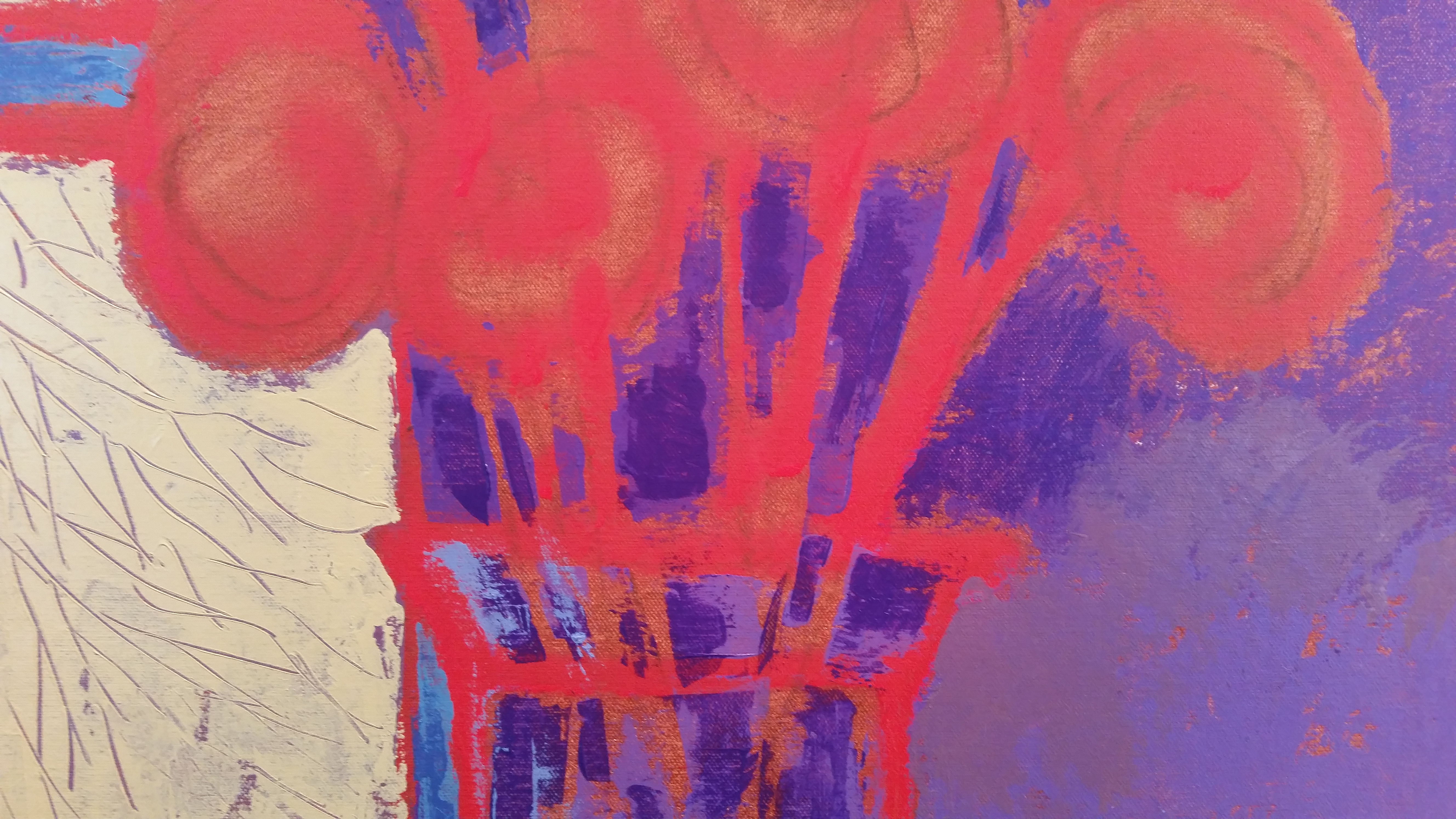
It is never a simple thing, painting. It is always a matter of selection–from color and medium, size and proportion, orientation and surface, brushes or knives, scruffy or smooth, thick or thin, garrish or quiet, thoughtful or bold, clean or complicated. This image of a small red dory is seemingly simple but has so many paint overs it weighs more than you think! It was a challenge to make a surface complex enough to be interesting yet simple enough to have the little dory (that sits in Provincetown, MA harbor) still be the star of the show. The actual red-orange color is a good amount brighter in real life but I think you get the idea here. A huge amount of blues balance the hot spot of red at the lower part of this painting. And that’s all this one was really about. But you are always welcome to have your own idea of what you see and feel in a painting. 18×36, acrylic on canvas. This is part of the 30 paintings/30 days challenge presented by Leslie Saeta on her blog,http://www.lesliesaeta.blogspot.com
Share this:

In With the New

Between the Seasons, 24×24, acrylic on panel
Seasonal transitions in New England are not so subtle hints that change is in the offing. Temperatures rising or lowering dramatically, colors intensifying or diminishing, textures smoothing or coarsening, sounds echoing or softening. Heading into winter or welcoming spring are the transitions that I look forward to each and every year. They find their way into my artworks in both subtle and obvious ways through more vibrant or subdued colors, understated or bolder forms, quieter or busier textures, and complex or simplified patterns. This particular painting known as Coming Solstice or Between the Seasons is a reflection on the landscape forms that surround me as well as my use of them in building a painting. It is the start of a new season and this approach will be the beginning of a new series of work for 2015. Hope you have great things on tap for the coming New Year.
Share this:

Gravity of Grays
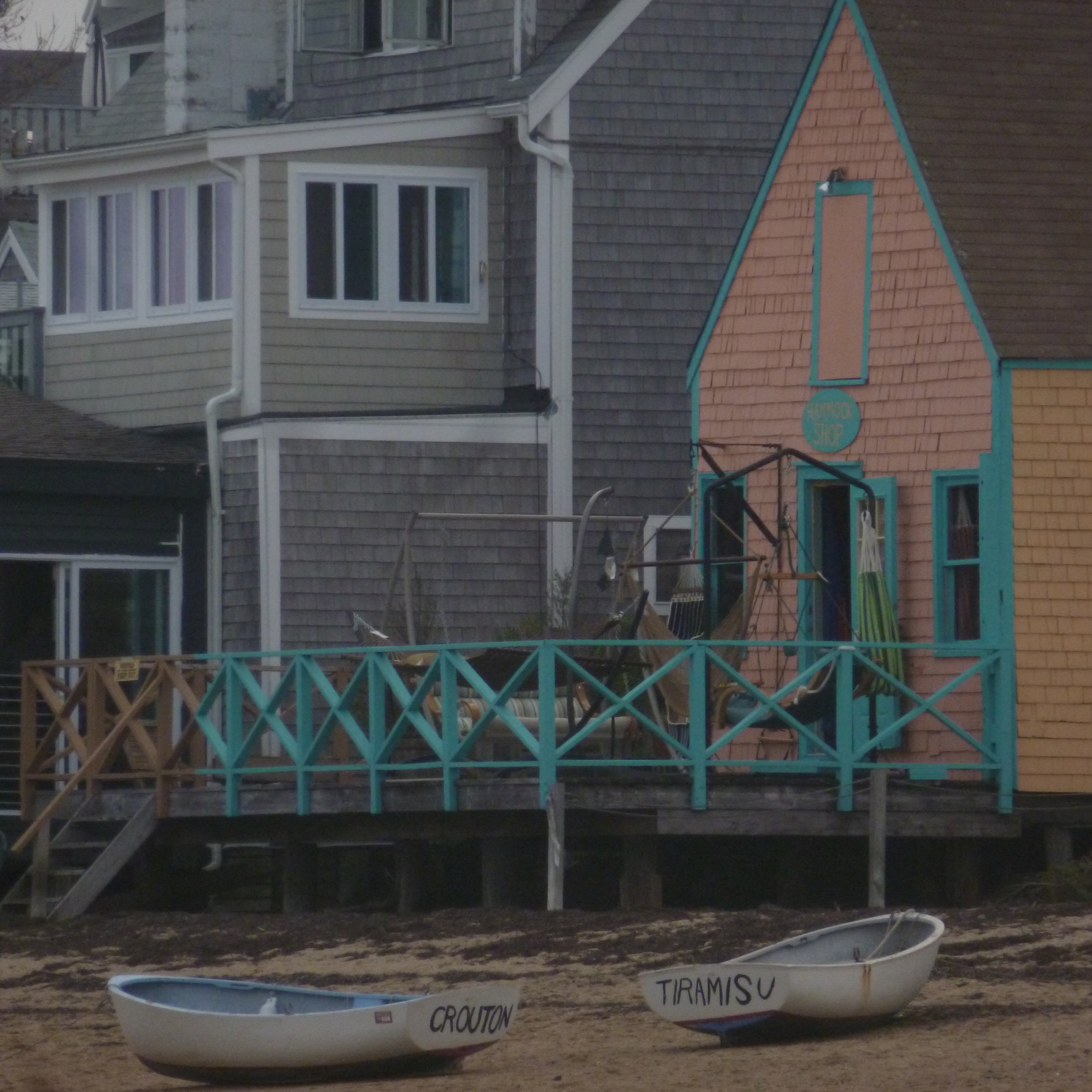
I love grays–they are very important colors–foggy, charcoal, steel, cool, warm, and Cape Cod grays. But what I really like in this snapshot is how gray creates background tones that contrast beautifully with all kinds of colors. From turquoise to soft peach to warm orange as in this photo. The various tones of grays of the shingles, boats, sand and misty air all combined to form an unusual color combination and one that I will be exploring in my paintings this winter.


